Blue-and-White Arita: Reading a Decoration Tradition
Blue-and-white Arita is a visual tradition, not one fixed design. Learn to read its cobalt motifs, changing layouts and individual clues with care.
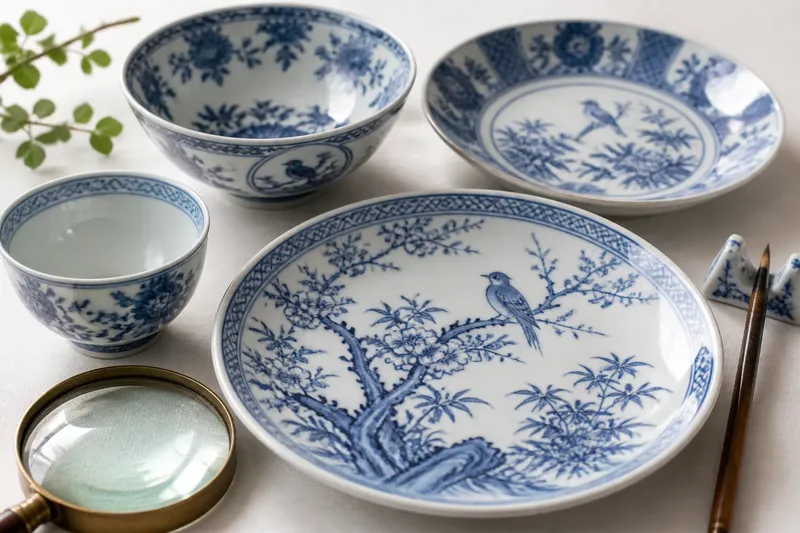
Blue-and-white Arita is a visual tradition, not a single pattern repeated across every plate and bowl. Look closely at the cobalt lines, the spaces between them and the way a motif meets the rim: those choices can tell you how a decorator organised a surface, even when they cannot identify a maker or settle a date.
What makes blue-and-white Arita recognisable?
The defining contrast is simple: blue decoration against a pale porcelain ground. The blue pigment, commonly associated with cobalt, is applied beneath a transparent glaze, so the finished design sits under a smooth, glassy surface. That arrangement differs from decoration painted over the glaze, which can have a different texture and visual character.
“Blue-and-white” describes a colour scheme and a method, not one motif, workshop or period. A flower, a landscape, a border of repeated marks and a scene filled with architecture can all belong to the tradition. Some pieces are restrained; others cover much of the surface with fine detail.
On a finished object, the glaze may soften the outlines or gather into a slightly deeper blue in places. Brush marks can vary in thickness. Those qualities are worth noticing, but no single shade or mark is a reliable shortcut to an exact origin. Surface appearance reflects the combined choices of the painter, materials and firing.
How did the visual tradition develop?
Arita’s blue-and-white decoration grew alongside the production of porcelain in the area. Once porcelain offered a pale, hard surface for painting, decorators could use it as a ground for clear, contrasting designs. Early blue-and-white wares belong to a wider history of East Asian porcelain and ceramic exchange; Arita’s version developed through local production, changing tastes and contact with other visual traditions.
Over time, the repertoire widened. Painters adapted familiar subjects and layouts, while workshops made pieces for different uses and audiences. A small cup calls for a different distribution of decoration from a broad dish. A border may frame a central picture, or a design may continue across the whole face. These are changes in visual organisation, not evidence that every object followed one orderly sequence.
Blue-and-white also continued alongside other ways of decorating Arita porcelain. Its long presence did not prevent the use of coloured enamels or other approaches. Nor did it freeze the style in place. A recognisable palette could accommodate fresh compositions, copied motifs and local variations without becoming a single, unchanging design language.
That is why a broad historical label should not be mistaken for a precise story. A blue-and-white bowl may share a visual vocabulary with other Arita pieces while differing in date, workshop, purpose and route to its owner. Establishing those details usually requires more than the colour of the decoration.
What should you look at first?
Begin with the overall layout. Ask where the eye lands: on a central motif, a framed scene or a repeated border. Then trace how the design handles the edges. Does it stop cleanly at the rim, wrap around the wall or break into separate panels? The answers describe the painter’s composition more securely than a guess at the subject’s meaning.
- Composition: Notice whether the design is centred, balanced across the surface or deliberately uneven.
- Brushwork: Compare broad filled areas with fine outlines, and look for changes in pressure or direction.
- Ground: Check how much pale porcelain remains visible. Open space can be as deliberate as a painted area.
- Border: See whether the rim has its own band, repeats a motif or connects to the main scene.
- Shape: Consider how the decoration responds to the object’s curve, foot, lip or interior.
A useful reading begins with what is plainly visible, then separates observation from interpretation. “A bird among branches, with a narrow border” is a careful description. “A scene of a particular legend” is a stronger claim and needs clearer evidence than a resemblance alone.
Can a motif identify one meaning or maker?
Not by itself. Flowers, birds, rocks, water and buildings recur across many decorative traditions, and familiar subjects can be drawn in markedly different ways. Even a motif that resembles a literary or seasonal reference may have been chosen for its visual appeal rather than to narrate a specific episode.
Look for combinations and placement instead of treating one symbol as a label. A cluster of motifs may suggest a theme, while its arrangement can reveal whether the painter prioritised a scene, a repeated rhythm or a decorative frame. Still, visual clues support interpretation; they do not always settle it.
Marks on the base can be useful evidence, but they need to be read cautiously. A mark might relate to a maker, workshop, owner, export or later handling, and marks can be copied or applied in different circumstances. An unfamiliar signature-like form is not proof of a named artist. For a significant attribution, consult a specialist in Japanese ceramics or a reputable collection catalogue.
How can you compare two pieces without forcing a match?
Imagine you have two blue-and-white dishes with birds and branches. One has a central scene with generous blank ground; the other repeats small birds around the rim. Describe those differences before calling them versions of the same pattern. The comparison can show shared subject matter while leaving room for distinct layouts, painters or production contexts.
For a useful comparison, record the object’s form, the position of its main decoration, the treatment of the border and any marks. Note whether the blue is used for outlines, filled shapes or both. A side-by-side view may reveal a shared convention, such as a framed central scene, without proving that the objects came from the same workshop.
What is not worth the effort? Trying to identify a precise date or designer from a single shade of cobalt, one flower or a vague resemblance to a picture online. Those clues can prompt further questions, but alone they invite overconfident conclusions.
What questions help you read blue-and-white Arita?
Is every blue-and-white porcelain piece from Arita?
No. Blue decoration on a pale porcelain body appears in more than one ceramic tradition. Treat “blue-and-white” as a description of appearance unless the object’s origin is supported by additional evidence.
Does cobalt blue always look the same?
No. Its appearance can vary with the pigment, application, glaze and firing, as well as the way the object has been lit or photographed. A difference in shade alone does not establish a different maker or period.
Can a repeated motif prove two pieces belong together?
It can show a shared decorative idea, but not necessarily a matched set or common workshop. Compare the shape, layout, borders and marks before drawing a stronger connection.
What should I do if an attribution matters?
Keep clear photographs of the whole object, its base and any visible damage, then seek an informed opinion from a Japanese ceramics specialist or established museum or auction catalogue. A careful description is more useful than a confident guess.
Why does the tradition resist one neat story?
Blue-and-white Arita is best understood as a changing visual vocabulary. Cobalt on a pale ground gives decorators a recognisable starting point; composition, brushwork, form and subject make each object more particular. Similarity is real, but it does not erase difference.
When you handle or study a piece, begin with its visible choices and keep your claims in proportion to them. That approach makes the tradition easier to appreciate: not as a parade of identical motifs, but as many distinct acts of design within a shared ceramic language.