The Matching-Set Myth: When a Table Can Mix Patterns
Mix patterned Arita ware with a limited palette and varied scale to make a table feel intentional, even when plates, bowls and cups do not match.
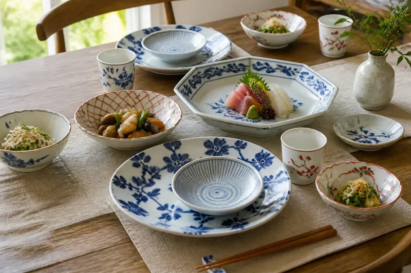
A mixed Arita ware table can look more considered than a matching set when its patterns share a small palette and differ in scale. The trick is not to make every plate agree; it is to give the eye a few clear connections, then leave room for contrast. A blue-and-white dish, a red-accented plate and a quieter bowl can sit together without pretending to be siblings.
That approach is useful when a cupboard holds pieces gathered over time, or when you want a table to feel lively without looking busy. Think of the arrangement as a small composition: colour provides the thread, scale controls the pace, and plain surfaces offer pauses. The plan below builds that composition through an ordinary week, then adapts it when guests, dishes or available pieces change.
What makes mixed Arita ware feel deliberate?
A pattern does not need to repeat exactly to belong. It needs a neighbour it can speak to. On Arita ware, familiar decoration may include cobalt blue, iron-red accents, green, yellow, or finely drawn details on a pale ground. A table can draw on those colours without asking every piece to carry them all.
Choose a limited palette before choosing individual plates. Two colours plus the porcelain ground often make a calm starting point; a third accent can add warmth if it appears sparingly. This is not a rule about the decoration of Arita itself. It is a practical way to keep several distinct motifs from competing at once.
Scale supplies the second connection. A broad, bold motif can sit beside a fine, closely drawn one, while a medium pattern bridges the difference. If every surface has a dense design, the eye has nowhere to rest. If every design is equally small, the table may read as a blur from across the room.
Form matters, too, but it need not be identical. A plate, a small bowl and a cup can carry different patterns when their colours or visual weight connect them. Keep the overall arrangement legible: let one pattern lead, give another a supporting role, and use a plain or lightly decorated piece as a pause.
How can a week of small choices shape the table?
You do not need to lay out the whole cupboard at once. A week gives you a low-pressure way to notice which pieces work together before the meal itself. Set aside a clean cloth or clear counter, and bring out only the pieces relevant to the next trial. Avoid stacking patterned ceramics in a crowded pile, where their colours and edges become hard to judge.
Day one: choose the palette
Look at the pieces you are most likely to use together. Pick the colour that appears most consistently, perhaps cobalt, then choose one companion accent already present in the group. Put aside designs whose strongest colours pull the arrangement in a different direction. They need not be excluded forever; they simply do not need to join this particular table.
Notice the ground as well. White or pale porcelain can act as shared breathing space even when the decoration differs. A creamier ground may sit differently beside a bright white piece, so compare them under the light where you usually eat rather than relying on memory.
Day two: sort by pattern scale
Arrange the selected pieces from boldest motif to finest. A large flower, crest or sweeping border may be the visual anchor; a small repeating pattern can provide texture without taking over. Put a middle-scale design between them if the jump feels abrupt.
Do not count motifs or aim for a mathematical arrangement. Instead, look from the doorway or the far end of the table. If one piece immediately shouts while the rest fade, either reduce its prominence or give it a quieter neighbour.
Day three: choose a lead piece
Give the table one clear starting point. It might be a serving dish with a confident border, or a pair of plates with the strongest blue. The lead should attract attention without forcing every other item to imitate it.
Then distribute the supporting patterns rather than clustering all the bold pieces together. A strong dish at one end can be balanced by a smaller accent elsewhere. The arrangement need not mirror itself; it only needs to avoid leaving one side visually crowded and the other empty.
Day four: add quieter surfaces
Bring in plain pieces, lightly decorated porcelain or a simple cloth. These surfaces are not merely fillers. They let intricate painting remain visible and make the changes in pattern scale easier to read.
When the table already has several decorated plates, a plain bowl or unpatterned cup may do more than another elaborate piece. There is no prize for using every attractive object at once. Save a favourite for a different meal if it disrupts the composition.
Day five: try the actual place settings
Set a place as you would serve it, using the plate, bowl and cup that make sense for the meal. Patterns that look promising in a cupboard can feel crowded when placed close together. Check whether a large motif on the plate clashes with a tightly patterned bowl directly above it.
Say you have a cobalt plate with broad flowering branches, a smaller dish with fine blue lines and a white cup carrying a red accent. Imagine placing the fine-lined dish on the bold plate and using the cup nearby. The shared blue connects the two dishes, while the red remains a small note rather than a new dominant colour; from across the table, the expected result is contrast with a clear visual link.
Day six: adjust for the meal
Consider the colour and texture of the food. A richly patterned serving dish may be a poor backdrop for a meal whose ingredients are already visually varied, while a quiet bowl can give the food room. For a simpler meal, more decorative pieces may feel appropriate.
Think about how dishes will move around the table. A serving plate that needs to be passed should not be surrounded by an arrangement so fussy that every movement feels disruptive. Leave practical space for hands, cutlery and shared dishes; the pattern plan serves the meal, not the other way around.
Day seven: make a small record
Take a quick photograph in the room’s usual light, or make a short note of the combinations you liked. Record the useful connection—“large blue motif beside fine blue border”—rather than trying to catalogue every piece. This gives you a starting point next time without turning table setting into a chore.
What should change when the table changes?
A plan is most useful when it can bend. If a guest brings a favourite patterned piece, look for one colour it shares with the existing group and let that be its link. You might move a competing accent off the table, or replace a busy side plate with a plain one. One small adjustment is usually clearer than adding several objects to make the newcomer fit.
For a larger gathering, repeat a few quiet elements rather than assigning every place a completely different combination. Similar cups, a consistent cloth or a repeated accent colour can provide continuity. The plates may still vary, but the shared elements help each place setting feel part of the same meal.
If the food itself brings strong colour, reduce the number of competing patterns. If the meal is visually simple, a more varied group can carry the atmosphere. And if a piece has sentimental or decorative importance, give it room to be noticed instead of burying it among equally emphatic designs.
It is not worth sorting an entire collection by tiny differences in blue or searching for a perfect symmetry that no one will notice while eating. Start with the pieces you use, then adjust what feels crowded. The point is a comfortable table, not a display case.
Which pattern questions come up most often?
Can different Arita patterns share one table?
Yes, if the pieces have a visual connection such as a shared colour, similar ground or balanced pattern scale. They do not need to come from the same set or carry the same motif.
How many colours should a mixed table use?
Begin with a small palette, often one leading colour and one accent against the porcelain ground. Add another colour only when it is already present in several pieces or has a clear supporting role.
Can a bold pattern sit beside a fine one?
That contrast can make both easier to see, especially when a medium-scale or plain piece gives the eye a pause. If the bold design dominates, move it to a less crowded position or use fewer strong patterns nearby.
Should every place setting match?
No. A table can feel cohesive through repeated colour or a few shared forms while allowing plates and cups to differ. Keep the overall palette connected, then vary the individual settings in a way that suits the pieces available.
How can you keep the idea useful beyond one meal?
Think of the arrangement as a set of choices you can reuse, not a fixed recipe. Keep a mental note of which combinations connect through colour and which need a quieter neighbour. Over time, the cupboard itself becomes easier to read: some pieces lead, some support, and some offer a welcome pause.
That is the useful answer to the matching-set myth. Mixed Arita ware works when the differences are chosen rather than accidental: a limited palette ties the pieces together, varied scale gives the eye movement, and plain surfaces keep the decoration legible. Start with one meal, make one adjustment at a time, and let the patterns share the table without asking them to match.